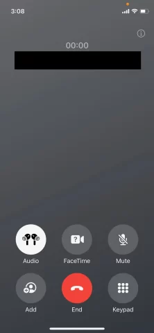
In response to user feedback, Apple has once again fine-tuned the placement of the end call button within the latest iOS 17 developer beta version. Notably, this modification relocates the button to the center at the bottom of the screen during active calls. This adjustment comes after the previous position in the bottom-right corner drew criticism from a segment of users.
Upon the initial release of the iOS 17 beta in June, Apple introduced an overhauled call interface alongside a range of fresh features. Among the changes was the consolidation of the end call button with other control functions, strategically positioned beneath the screen.

Yet, the design drew notable concern due to the unusual placement of the sizeable red end call button in the bottom-right corner. This deviation from the expected central placement generated inconvenience for users accustomed to the traditional position in earlier iOS iterations.
Evidently attentive to user preferences, Apple has heeded the feedback in iOS 17 beta 6, relocating the end call button to the center of the interface. It now seamlessly resides between the “Add Contact” and “Keypad” buttons, offering a more intuitive arrangement.


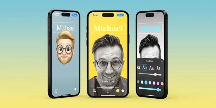
The rationale behind Apple’s adjustment likely encompasses usability considerations and aligns with the company’s ethos of delivering a user-friendly experience. Moreover, this alteration harmonizes with the introduction of iOS 17’s new feature – Contact Poster. This feature enables users to view full-screen photos or memojis during ongoing calls, presenting an additional layer of engagement.
The comprehensive changes brought by iOS 17 extend beyond the end call button positioning, encompassing various enhancements and innovations. As anticipation builds, this specialized iPhone operating system is poised to coincide with the unveiling of the iPhone 15, an event projected for the middle of September.

